| Author |
 Topic Topic  |
|
|
richfed
Sachem


USA

Bumppo's Patron since [at least]:
May 13 2002
Status: offline
Administrator |
 Posted - February 27 2003 : 05:31:51 AM Posted - February 27 2003 : 05:31:51 AM


|
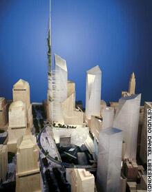
Today, the new design selected for the re-development of the World Trade Center site will be officially announced.
And ... the winner is ...

What do you think?
A couple of snippets, courtesy of CNN:
quote:
[The] proposal featured a tower 1,776 feet tall, symbolic for the year of American independence, that would demonstrate "the durability of democracy," while the top floors would be filled with indoor gardens as a "confirmation of life." The tower would be the world's tallest.
quote:
The architect says that having calculated the arc of the sun, a wedge of natural light would funnel visitors to the memorial site, and that every September 11 between 8:46 a.m., when the first tower was struck by a plane, and 10:28 a.m., when the second tower collapsed, no shadows will be cast by his buildings.
Pretty impressive, is my first reaction! I like it!
|
|
report to moderator
|
|
|
Theresa
Bumppo's Tavern Proprietress


USA

Bumppo's Patron since [at least]:
May 17 2002
Status: offline
|
 Posted - February 27 2003 : 05:40:49 AM Posted - February 27 2003 : 05:40:49 AM


|
I think I like the symbolic aspects rather than the visual on this one. It looks sorta futuristic to me. But all and all, it will be exciting to see it go up.
|
Theresa |
report to moderator  |
|
|
Scott Bubar
Colonial Militia
   

USA

Bumppo's Patron since [at least]:
May 17 2002
Status: offline
|
 Posted - February 27 2003 : 10:55:43 PM Posted - February 27 2003 : 10:55:43 PM


|
Personally, I was hoping for a meadow.
With some sheep and a few cattle.
And a lake. With an island.
On that island, two stone monoliths. Not huge monoliths, just modest monoliths.
With the names of the dead inscribed thereon.
|
~~Aim small, miss small. |
report to moderator  |
|
|
Wilderness Woman
Watcher of the Wood


USA

Bumppo's Patron since [at least]:
November 27 2002
Status: offline
Donating Member |
 Posted - February 28 2003 : 08:20:52 AM Posted - February 28 2003 : 08:20:52 AM


|
I like it! I love the symbolism. (Will the "no shadow" thing really work?) It will be interesting to see what they come up with for the actual Memorial area in the center.
I found the following site that shows a couple more views of the design. I especially like the way it looks in the NY skyline. I think it was the best of the seven final designs, to be sure. A couple of them were really weird looking, especially one that looked like a tic-tac-toe grid!
www.glasssteelandstone.com/US/NY/WTC2-2Libeskind.html
By clicking on the link below the last photo, you can see the other 6 designs. |
report to moderator  |
|
|
richfed
Sachem


USA

Bumppo's Patron since [at least]:
May 13 2002
Status: offline
Administrator |
 Posted - February 28 2003 : 6:57:34 PM Posted - February 28 2003 : 6:57:34 PM


|
| Yeah, they chose the best one! You are right! The tic-tac-toe design is very strange. I rather liked the night, skyline shot of the glass & steel one ... looked like the ghosts of the originals. |
report to moderator  |
|
|
Scott Bubar
Colonial Militia
   

USA

Bumppo's Patron since [at least]:
May 17 2002
Status: offline
|
 Posted - March 01 2003 : 08:26:10 AM Posted - March 01 2003 : 08:26:10 AM


|
quote:
Originally posted by Wilderness Woman
... (Will the "no shadow" thing really work?) ...
I'm curious about that one as well.
Perhaps the idea is to cancel the shadows within the circle by using the reflectivity of the buildings?
I see no way to avoid shadows to the west of the complex, though. |
~~Aim small, miss small. |
report to moderator  |
|
|
Theresa
Bumppo's Tavern Proprietress


USA

Bumppo's Patron since [at least]:
May 17 2002
Status: offline
|
 Posted - March 01 2003 : 11:21:30 AM Posted - March 01 2003 : 11:21:30 AM


|
And what about the change of seasons when the sun is lower in the sky in winter and higher in summer?
|
Theresa |
report to moderator  |
|
|
Wilderness Woman
Watcher of the Wood


USA

Bumppo's Patron since [at least]:
November 27 2002
Status: offline
Donating Member |
 Posted - March 01 2003 : 12:52:14 PM Posted - March 01 2003 : 12:52:14 PM


|
BTW, did anyone notice the additional symbolism in the winning design? If you go to the above link I posted, and look at the skyline view "photo" of the winning design with Lady Liberty on the left side... Now look at the tallest tower of the main building. Doesn't it "echo" the outline of Lady Liberty with her right arm raised to the sky? I Love It!  |
report to moderator  |
|
|
Adele
The Huggy Merchant
   
Bumppo's Patron since [at least]:
May 17 2002
Status: offline
|
 Posted - March 10 2003 : 01:55:04 AM Posted - March 10 2003 : 01:55:04 AM


|
I guess I am really with Scott on this one...I think a green space would have been good - although I can understand the need to rebuild, smacks of the 'you knock me down, I come back stronger' attitude.
HM |
report to moderator  |
|
| |
 Topic Topic  |
|

![The Mohican Board! [Bumppo's Redux!] The Mohican Board! [Bumppo's Redux!]](images/wwwboard.gif)


